From Supply Chain SaaS to Climate Tech
Platform
Web (Landing Page)
Role
UX & Product Designer
Tools Used
Wordpress
Figma
Microsoft Clarity
Google Analytics
Type
Redesign
01 / Overview
A N recently underwent more than a visual refresh — it redefined its identity.
What started as a blockchain-powered supply chain product is now a purpose-driven climate tech platform, and the website needed to reflect that shift — fast, clear, and conversion-focused.
My goal?
Design a clean, minimal, yet impactful landing experience that moves away from operational jargon and toward planet-first positioning.
#232323
#eff7fc
#032a3e
#f7f7f7
02 / Design in Action
⸺ Above the Fold That Speaks Volumes
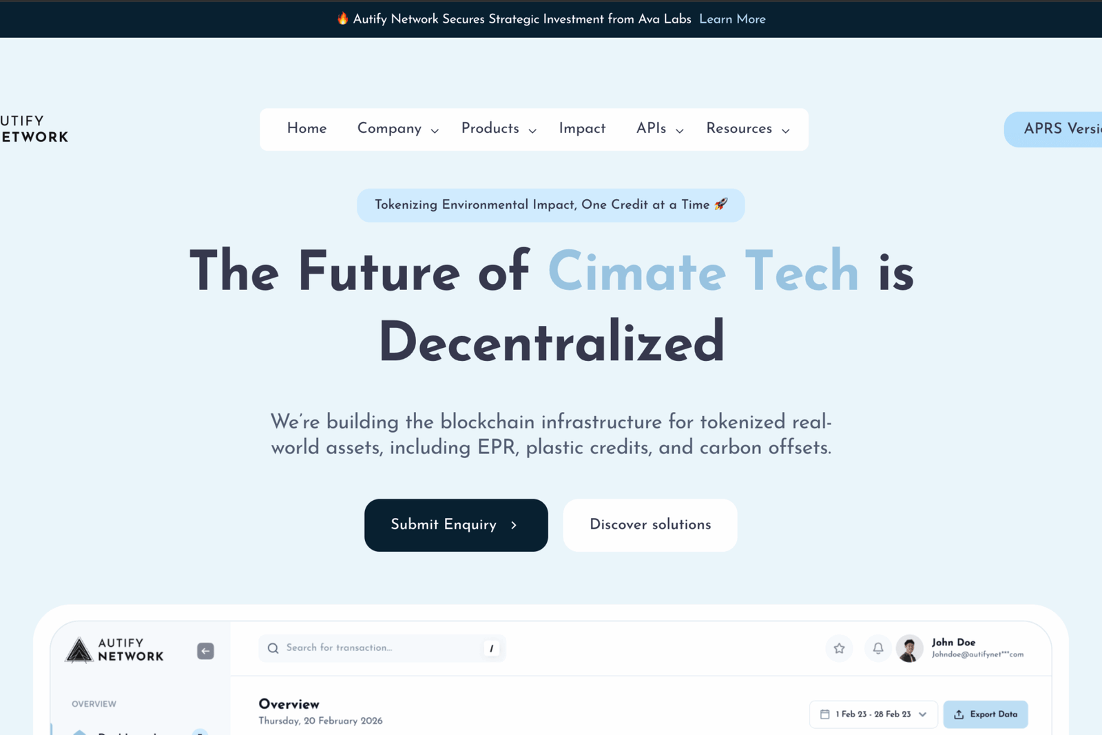
The hero section leads with a bold purpose statement, clear CTA, and zero clutter. No scrolling needed to understand who we are and what we do.
⸺ Data-Informed Layout Decisions
Using Microsoft Clarity and Google Analytics, I identified drop-off zones, underperforming sections, and high-engagement hotspots. This allowed me to restructure the page flow and CTA placements — backed by real user behavior.
⸺ Clean Grid. Clear Hierarchy.
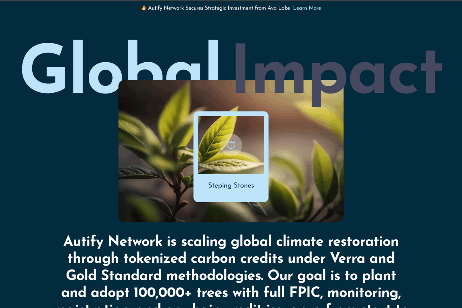
I reduced cognitive load by streamlining the visual hierarchy — fewer font sizes, fewer colors, stronger contrast. Every section was built to pull the user gently forward.
03 / The Problem
The previous site was functional, but fragmented — too focused on supply chain language, too dense with technical jargon, and too light on storytelling.Users weren’t scrolling.
The narrative didn’t connect.The brand didn’t feel climate-first.Clarity and GA data confirmed it:
Scroll depth dropped off at 32% Users skimmed, bounced, and didn’t convert
04 / The Shift
I worked with the founding team to reposition the brand from “supply chain infra” to climate action enabler.That meant:
Simplifying the message
Making the mission clear up top
Designing with whitespace, hierarchy, and trust
We weren’t just redesigning — we were reframing the story.
05 / Design Goals
- Create a homepage that’s minimal but memorable
- Reposition the brand as a climate-first platform
- Use data (scroll maps + heatmaps) to guide layout decisions
- Improve scroll depth and on-page engagement
06 / Impact
A dedicated section to add, view, and manage vendor relationships, complete with contact info, documents, and linked transactions.
Vendor profiles with quick PO access Brand-owner mapping for easy accountability
07 / Takeaway
Design isn’t just about what looks good — it’s about what moves people.
This project was a reminder that when brand, data, and design align, you don’t just get better websites —
you get better conversations.


