01 / Overview
P S came with a clear ask:Make vendor operations smoother, smarter, and scalable.The juggle between spreadsheets, scattered emails, and legacy systems was REAL. I helped design a streamlined dashboard experience that brings clarity, control, and consistency — all in one place.
Client
PS (Cannot Disclose)
Industry
B2B Finance
Services
UX Research
Product Design
Design System
Tools Used
Figma
Miro
Notion
Draw.io
02 / UX Research
I started by speaking directly to the people at the heart of the process: procurement heads, finance teams, and vendor managers.Their pain points?
No clear view of where a vendor stands Too many manual follow-ups Compliance bottlenecks causing payout delays I used these insights as the foundation for design decisions
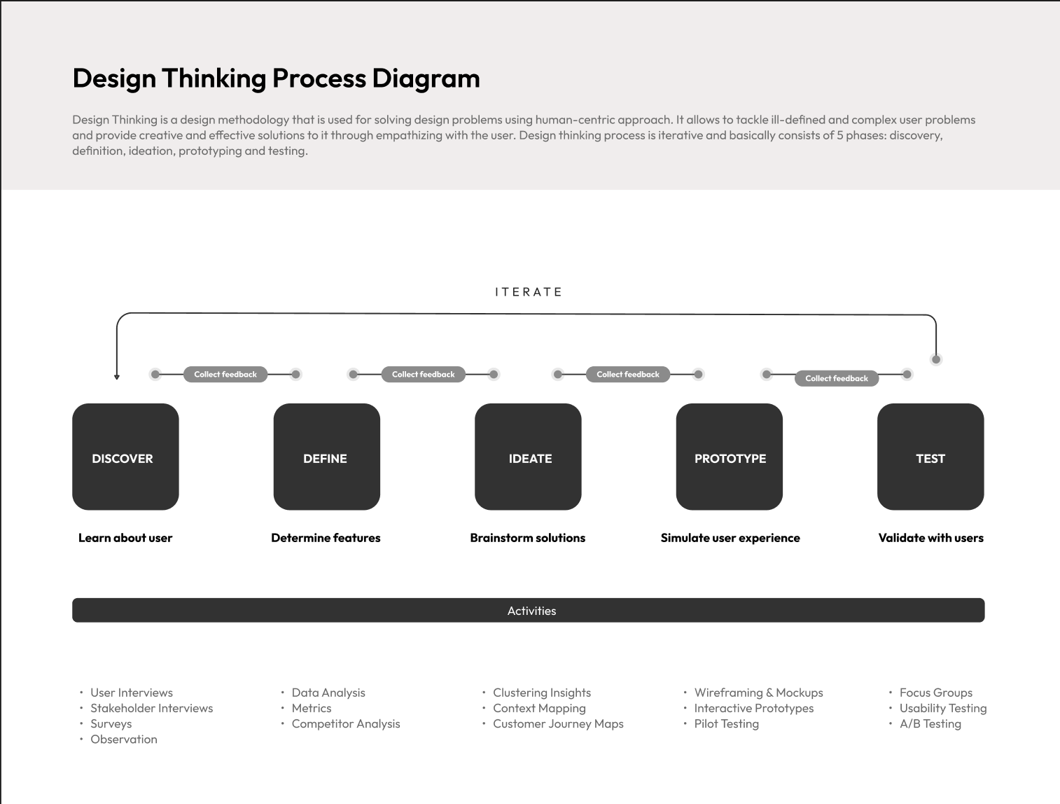
2.1 / The Design Thinking Flow
Every step was rooted in real user problems. Every decision focused on creating tangible business impact.
Empathize → Define → Ideate → Prototype → Test → Deliver
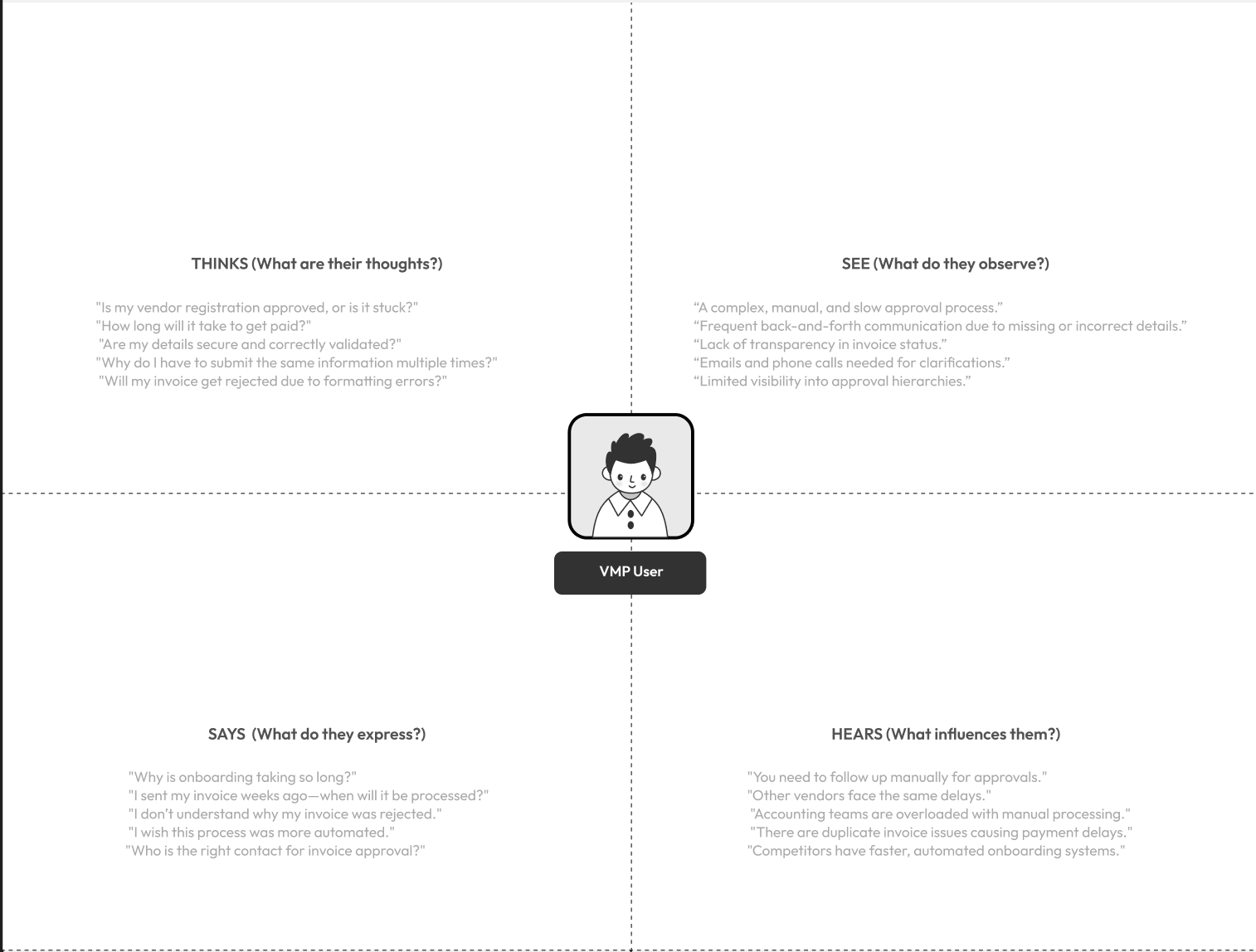
2.2 / Empathy Mapping
I mapped what users thought, saw, said, and did.
Spoiler: it was a mess of emails, PDFs, and “Hey, did we get that doc?” moments.
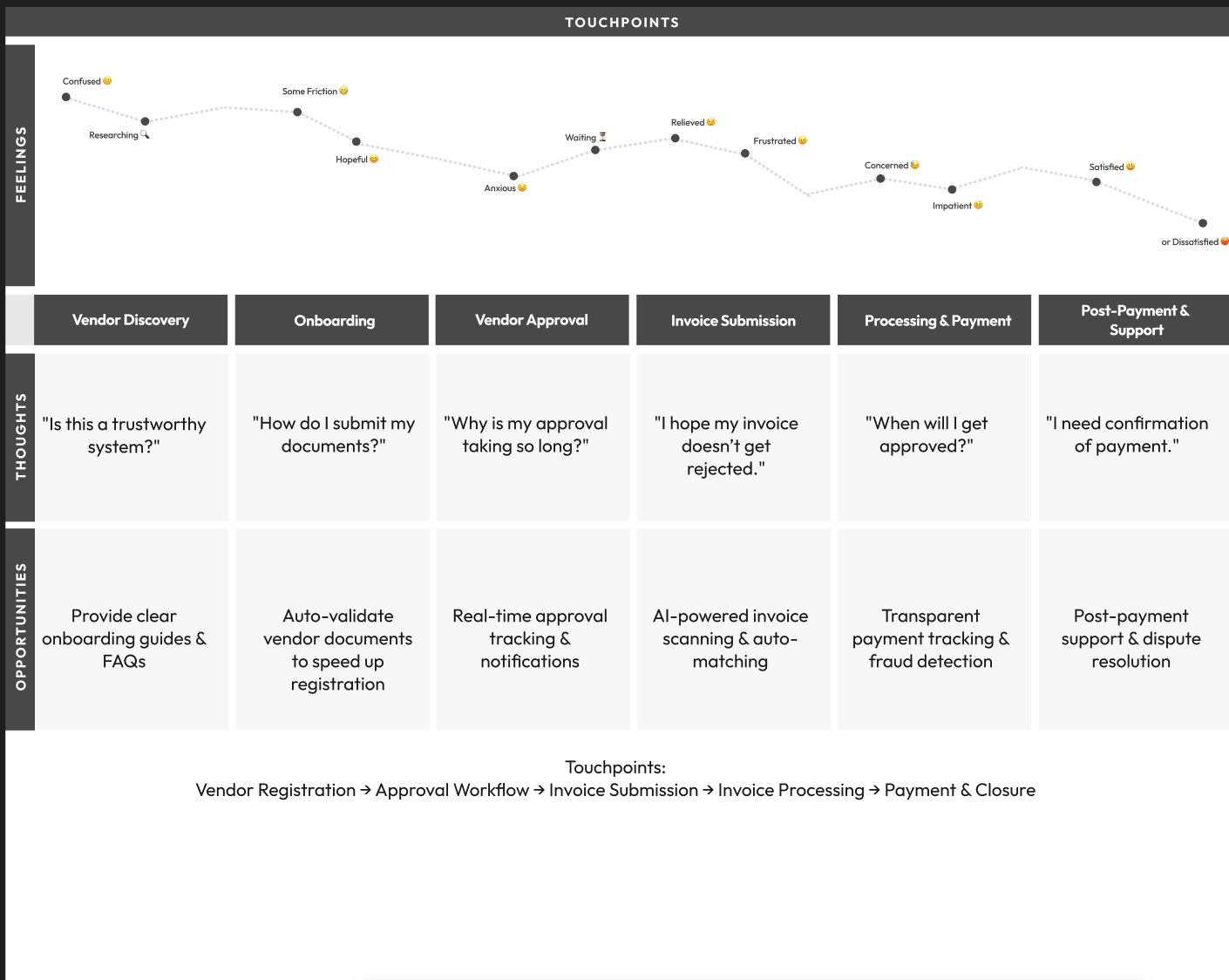
2.3 / Journey Mapping
I broke the vendor experience down into key stages:
From onboarding → documentation → compliance → payout.
At every step, I asked: How can I make this easier, faster, and clearer
2.4 / User Persona
I designed this dashboard with her (and her sanity) in mind.
Meet Anjali, a Vendor Ops Manager juggling compliance checks, document chaos, and constant follow-ups.
03 / Information Architecture
Before designing screens, I structured the experience.The layout includes:
Vendor Overview Onboarding Timeline Document Vault Activity Feed Risk Flags Payout History Everything exactly where users need it.
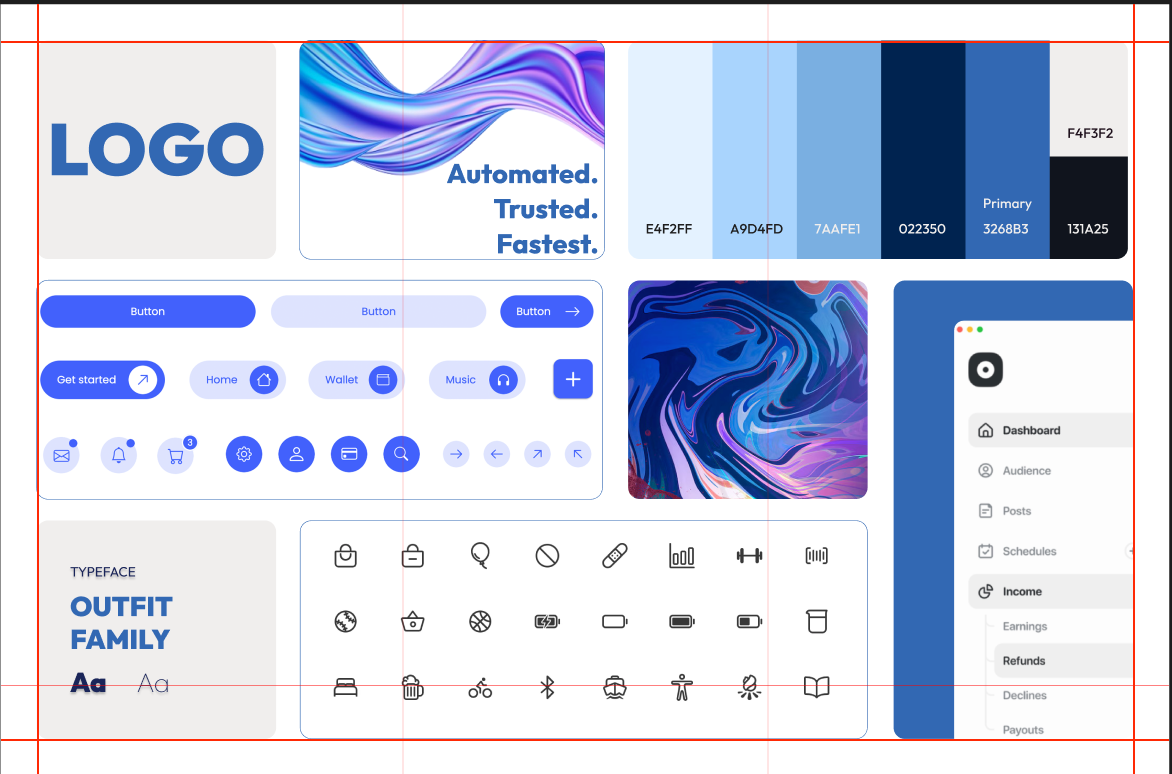
04 / Mood Board
I aimed for:
Clean grids
Neutral tones with meaningful highlights
Familiar patterns that reduce the learning curve
My visual direction was inspired by modern, minimal enterprise dashboards.
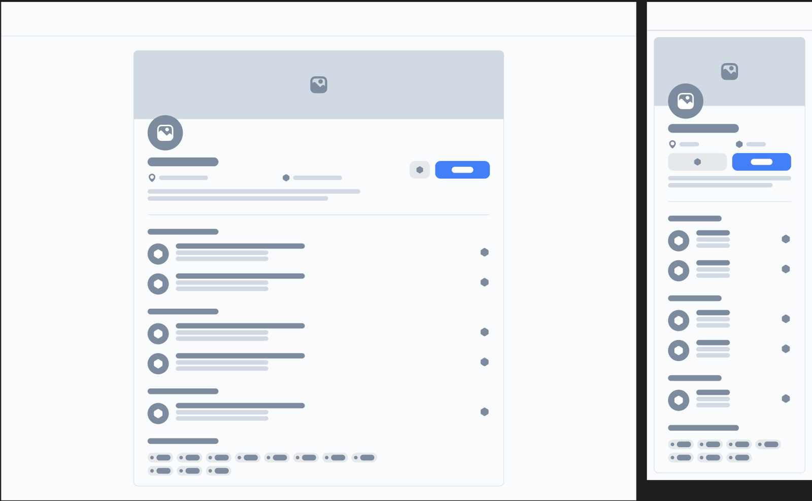
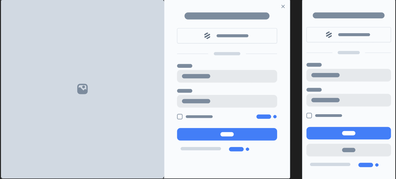
05 / Wireframes
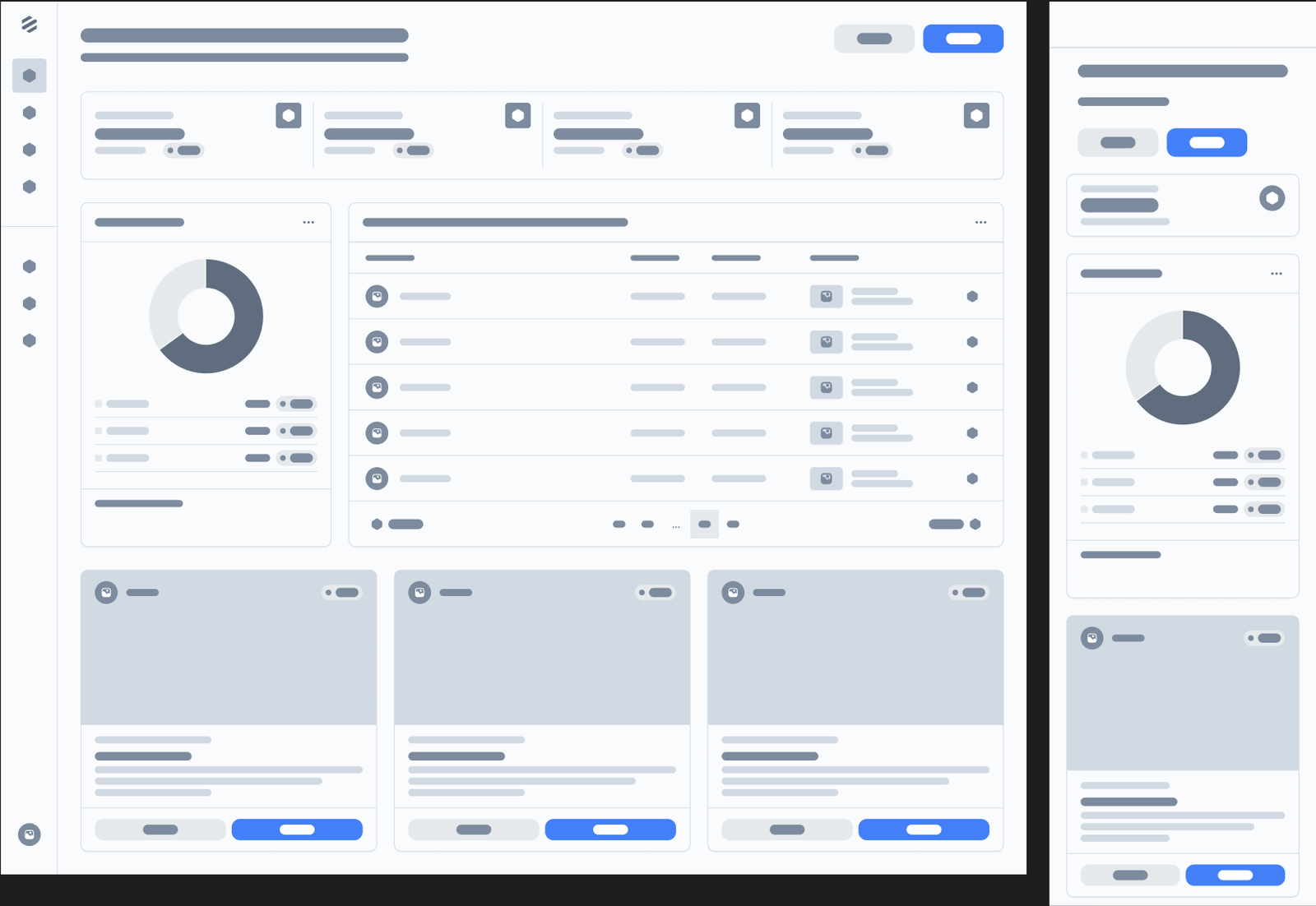
I used low-fidelity wireframes to quickly validate layout logic, content hierarchy, and core user flows.
Early alignment helped avoid wasted cycles later.
06 / High-Fidelity UI
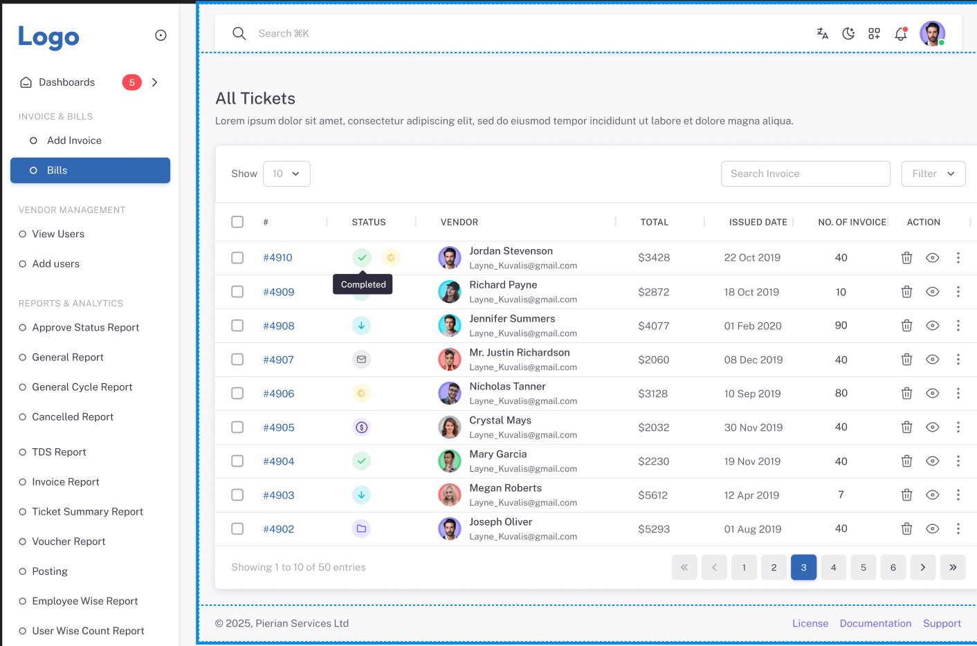
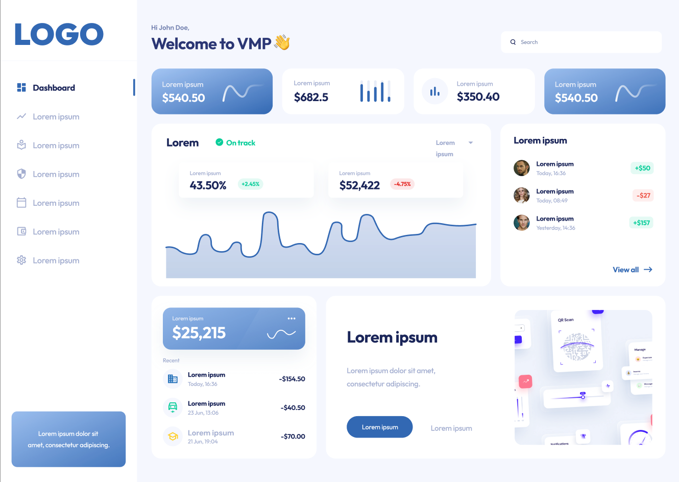
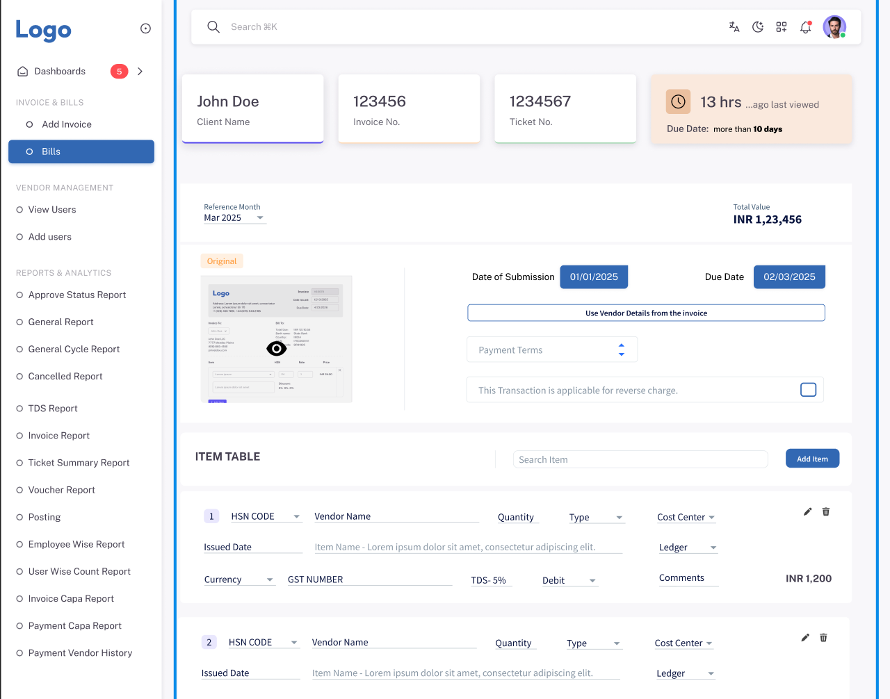
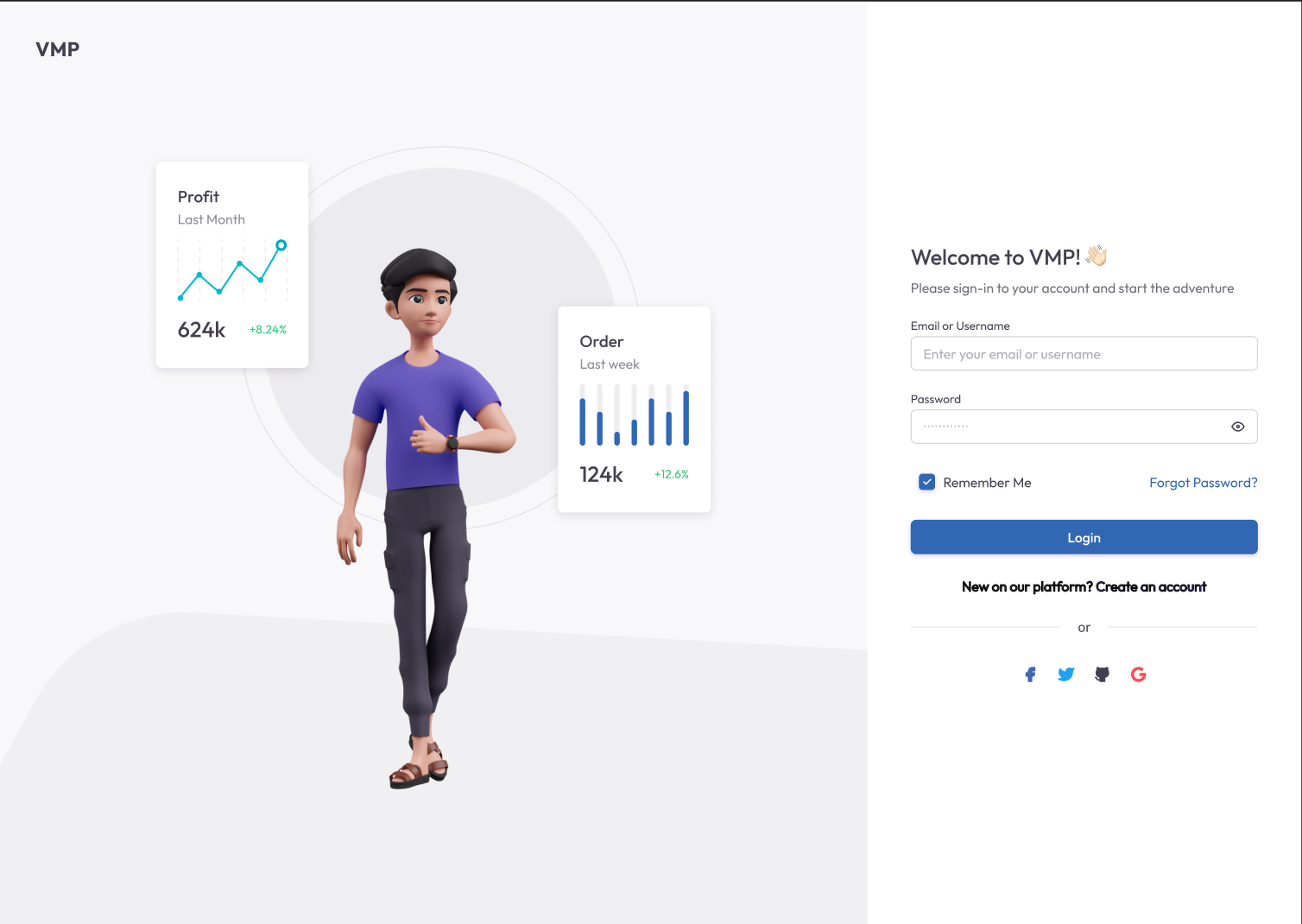
This is where the product came to life.I designed:
A visual onboarding tracker with clear status indicators A smart document vault with tagging, expiry alerts & versioning A payout dashboard with clarity and filters built-in Risk flags to surface critical issues proactively The entire interface was built to be clean, responsive, and scalable.
07 / Handoff
I Ensured a smooth developer handoff through:
Dev-ready Figma files with annotations
Clickable interactive prototypes
Style and component tokens shared via Zeplin/Notion
7.1 / Style Guides
From typography choices and spacing rules to layout grids and component structure, I ensured every visual decision was intentional and consistent. This created a strong foundation for scalable design.
Color tokens, icon sets, and interactive states were all carefully documented — giving developers clarity and reducing implementation guesswork.
#232323
#3268B3
#f7f7f7
Headlines:
Google Font - Outfit
A B C D E F G H I J K L M N O P Q R S T U V W X Y Z 1 2 3 4 5 6 7 8 9 0 A B C D E F G H I J K L M N O P Q R S T U V W X Y Z 1 2 3 4 5 6 7 8 9 0 A B C D E F G H I J K L M N O P Q R S T U V W X Y Z 1 2 3 4 5 6 7 8 9 0
Paragraphs:
Google Font - Outfit
Lorem Ipsum is simply dummy text of the printing and typesetting industry. Lorem Ipsum has been the industry's standard dummy text ever since the 1500s, when an unknown printer took a galley of type and scrambled it to make a type specimen book. It has survived not only five centuries, but also the leap into electronic typesetting, remaining essentially unchanged. It was popularised in the 1960s with the release of Letraset sheets containing Lorem Ipsum passages.
7.2 / Tailwind Breakpoints
I implemented Tailwind’s responsive breakpoints to ensure the dashboard looked and performed seamlessly across devices. By leveraging utility classes likesm, md, lg, and xl,
I created a fluid layout that adapts naturally from tablet to widescreen. This approach made the design system truly responsive — without adding complexity.
Web App (1536 px)
Grid : 12
Type : Stretch
width : 90 px
Gutter : 30 Px
Web App (1280 px)
Grid : 12
Type : Stretch
width : 60 px
Gutter : 30 Px
Tablet (768 px)
Grid : 8
Type : Stretch
Margin : 24 px
Gutter : 30 Px
Mobile (360 px)
Grid : 4
Type : Stretch
Margin : 16 px
Gutter : 20 Px
7.3 / Design System
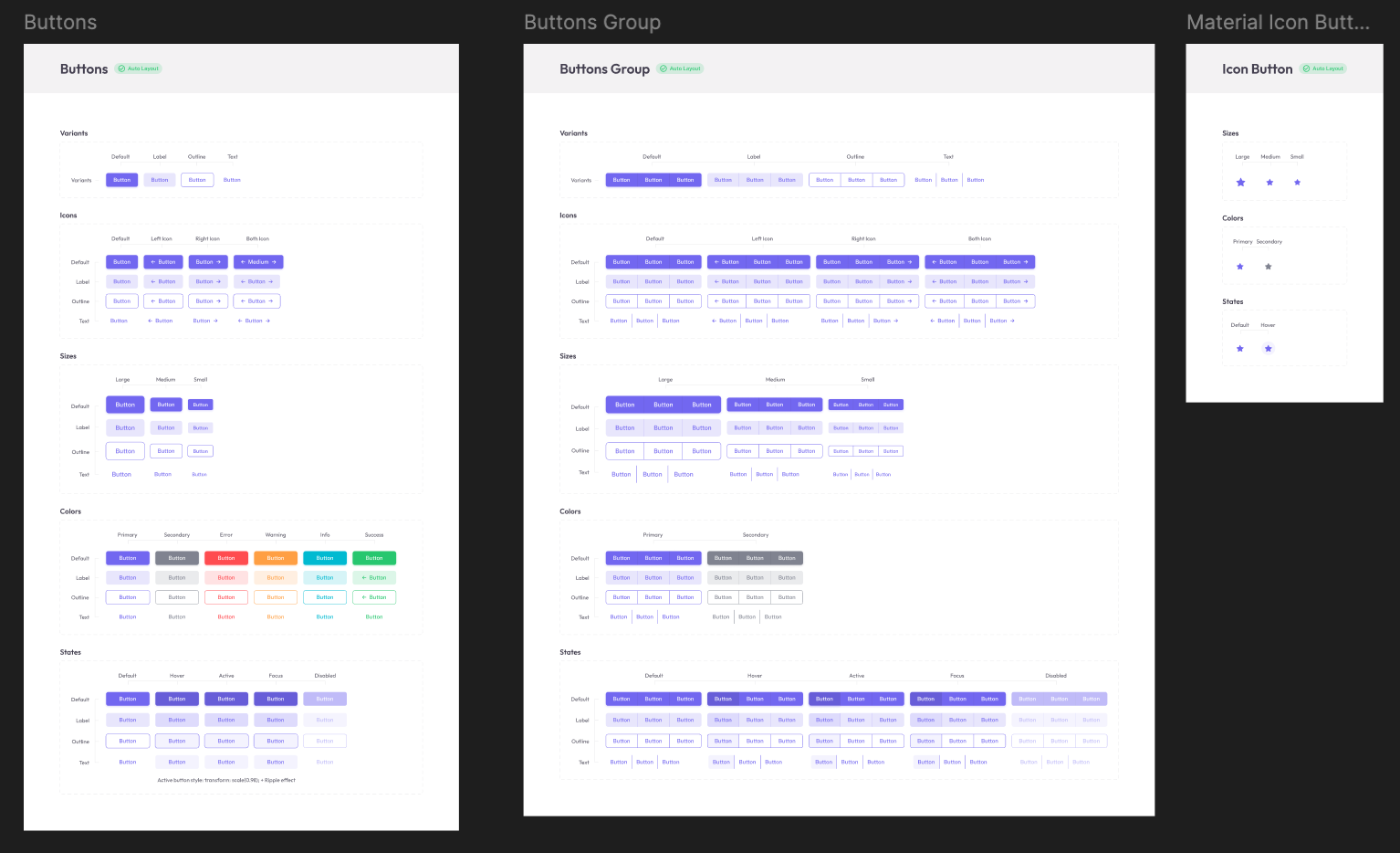
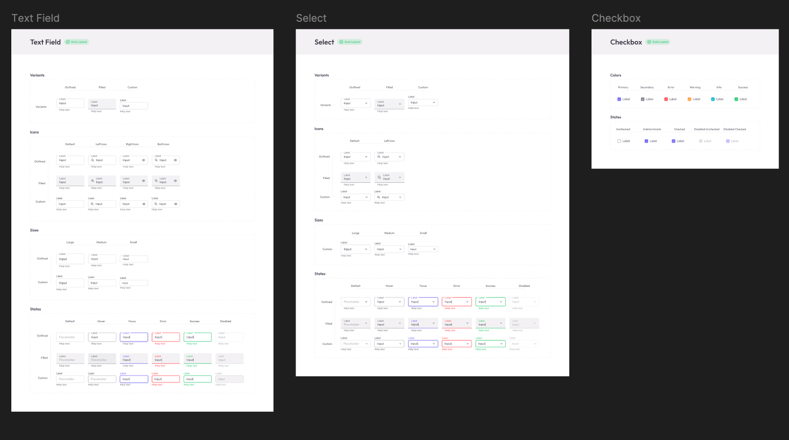
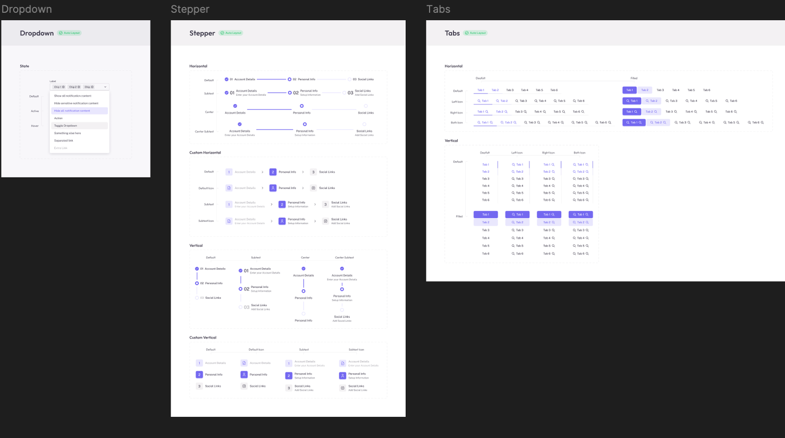
I created a reusable design system including:
Buttons (Primary, Secondary, Disabled States)
Form Elements (Input, Select, Validation States)
Cards, Tables, Tags, Tabs
Status Indicators with color-coded logic
Notifications & Toast Components
This system reduces design debt and accelerates new feature rollouts.
